By Rahul Kumar, Data Scientist at AlgoAnalytics
Data Visualization is a very useful technique that can help data scientists, domain experts as well as the “end customer” (the data owner) gain insights into the data. This is often the first step to understand the data better before further AI/ML models are built. Visualization helps a data scientist to choose the features/parameters or generate new features from existing features while model building. Further, for the domain experts, data visualization can help understand the data behavior and map the same to business processes.
Visualization in time-series data:
Time series data are available in many domains such as manufacturing (IoT) data, healthcare (patient) data, stock prices, etc. Time Series data are hard to interpret simply by looking at them, as they may have a lot of hidden information in terms of data trends and patterns. Data visualization helps in finding such hidden information. For example, visualization may help answer questions such as:
- How are the time series values changing with time?
- What is the range of time series over a period of time?
- Does the data show any trend (whether the values are going up or down)?
- Is there any seasonality in the data?
- At some point in time, is any data point going out of the usual range?
In this article, we will discuss the tools/libraries we at AlgoAnalytics typically use for data visualization.
The following tools are discussed in this short article:
- Plotly
- Dash by Plotly
- Grafana
Plotly:
The Plotly python library is an interactive, open-source plotting library that supports over 40 unique chart types covering a wide range of statistical, financial, geographic, scientific, and 3-dimensional use-cases. Plotly is supported in both R and python and is written in javascript.
Even though libraries such as Matplotlib, Seaborn are used extensively, due to their static nature people have to rerun their code to check data at different scales. Since Plotly is interactive, one can zoom in/out at a particular point without recreating the plot. Features such as hover over text at run time, zoom in/out, outscaling of axes when zoomed in/out, download in HTML format, are a few of the key features that Plotly provides. Since it is written using Javascript, it enables users to create interactive web-based visualizations that can be shown in Jupyter notebooks, saved to HTML files, and later passed to the clients and other stakeholders of the project. It supports a variety of graphs e.g. bar plot, scatterplot, histogram, boxplot, violin plot, etc. These plots are interactive unlike in other traditional libraries.

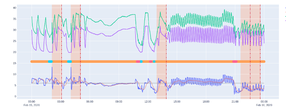
Fig. 1 Plotly time series plot for manufacturing data with anomaly marked
Figure 1 shows a sample multivariate time series plot containing three times series of IoT data and the time at which something happened to the machine. The vertical red dotted line tells the time at which the anomaly has occurred. The vertical orange band before the red dotted line is the 1 hour window before the anomaly occurred. This is to see whether something abnormal happened before the anomaly occurred. This band is customizable. We can also zoom in at any particular region to see the data at greater granularity. This is very useful, especially when you have large time-series data.
Ploty is a very powerful and easy-to-use tool and is being used by data scientists extensively, as it provides a very good user experience.
Dash:
Dash is a library provided by Plotly and used to make web-based visualization applications. It is built on top of Plotly and Flask. It can be used to make web-based apps that could be used by data scientists/domain experts for visualization. Even a data scientist who has very little knowledge in UI development can make a web-based application using Dash. With the help of Dash, one can make a very interactive, beautiful dashboard. It allows a lot of customization in the web app without much effort.
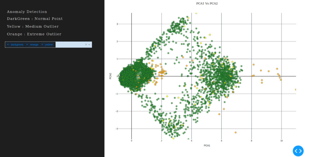
Figure 2 below shows a screenshot of a web app containing a scatterplot of multivariate time series data after dimensionality reduction using PCA. On this data, we used an outlier detection algorithm to find anomalous points in the data.
- Green points represent non-outlier points
- Yellow points represent fewer outlier points
- Orange are the extreme outliers.

Fig. 2 Scatter plot for dimensionally reduced (Principal Component Analysis) using Dash
Here we can see that orange and yellow points are away from the dense green cluster. After hovering on these points we can see the time at which these outlier points occurred. Then we can see it in the actual time series to find the patterns around that time. We can do multiple customizations in this app such as choosing what to show when hovered over the points or color of points, size of points, etc. One can make dashboards in the Dash web app containing various combinations of graphs easily. Each graph is a Plotly graph and therefore quite interactive and customizable.
Grafana:
Grafana is an open-source tool for visualization which can be used to monitor real-time data from different data sources. It has plugins that could be used to connect different tools/databases such as ElasticSearch, influxdb, etc. Since it supports many databases we can query the database table from Grafana itself. This could be a very useful feature while monitoring real-time data such as manufacturing IOT data.
Grafana provides a dashboard where we can add panels for the graphs we want to visualize. One can add one or more panels to the dashboard. Each panel holds a graph of a specific type. To make Grafana dynamic there are variables in Grafana. These variables appear as dropdown lists at the top of the dashboard and accordingly one can change the query dynamically with the help of these variables. One can also set alerts in Grafana which can be very useful for monitoring changes in the data.

Fig. 3 Top has a time series plot of a single feature, the bottom plot has anomaly points for the same feature
Conclusion:
Visualizations are very helpful for a data scientist to gain insights, frame problems, and interpret results. It has also helped us a lot to share these insights with all stakeholders.
At AlgoAnalytics, we are effectively using all the three tools discussed here for visualizing data in a variety of domains. These data visualization tools have helped us understand the data better and contributed to building better AI/ML models in the end.
Demos and Contact Info:
For demo visit our link https://algoanalytics.com/demoapp
For further information, please contact: info@algoanalytics.com

